A few years ago I came home from QuiltCon with a fabric bundle I couldn't stop touching. Every print was beautiful. Then I spread them out on my table to plan a quilt, and my heart sank a little.
They were all about the same value. Lovely on their own. Mush side by side. None of them went together the way I'd want to use them in a quilt.
So I pulled my favorite print out of the stack and started over with just that one fabric.
That's the method I want to walk you through today. One fabric you love, a handful of color chips, and your stash. So let's dive in.
Why Start with One Fabric You Love
Every multicolor print is a color palette someone already worked out. The fabric designer picked those colors on purpose and tested how they look next to each other. When you build from a feature fabric, you get to borrow all that work.
You also start from love instead of doubt. If you adore the print, you're already halfway to a quilt you'll be proud of.
If you want the vocabulary behind why this works, my color theory guide for quilters walks through hue, value, tints, tones, and shades.
Step 1: Pick the One Fabric You Love
This is the fun part. Go to your stash, or your favorite shop, and find the print you keep coming back to.
A few things make a print a strong feature fabric:
- It has several colors in it. Three or more gives you plenty to pull from.
- It has some light and some dark. A print with a range of values makes Step 3 easier.
- You'd be happy to see it in big pieces. This fabric is the star of your quilt. Pick one you won't get tired of looking at.
My feature is a deep green print with coral tulips, sage leaves, and tiny rust berries. It was my favorite from that QuiltCon bundle, and it had everything I needed.

Step 2: Match Color Chips to Your Print
Pull out your color chips and lay them right on top of your feature fabric. Find a chip for every color you see.
I use Kona solids chips, but any fabric line with a color card works for this step. Chips make matching easier because you're looking at one pure color at a time, with no other print competing for your attention.
Look closely. Don't stop at the big, obvious colors. Hunt for the small accents too. The rust berries in my print take up hardly any space, and they still gave me one of my palette colors.

For my print, I pulled chips for:
- A soft peach from the lightest parts of the tulips
- Coral from the tulips
- Rust from the berries
- Sage from the leaves
- Deep green from the background
Step 3: Check Your Chips for Value
Before you head to your stash, stop and check value. This is the step my QuiltCon bundle skipped.
Value is how light or dark a color is. A palette needs lights, mediums, and darks, or your quilt design blurs into one big blob.
Lay your chips in a row from lightest to darkest. Then take a photo with your phone and switch it to black and white. The color falls away and you see value only.

Here's what to look for:
- A clear light, medium, and dark. If your row steps from light to dark in a way you can see, you're in good shape.
- Chips that turn into the same gray. Two chips that match in black and white will blend together in your quilt. Keep both if you love them, but know they'll read as one. Or swap one for a lighter or darker chip.
- A missing end. No true light or no true dark? Go back to your print and look again. There's usually a highlight or a shadow you skipped.
In my row, the peach is clearly my light and the deep green is clearly my dark. Everything else fills in the middle.
Want to go deeper? How Color Value Makes or Breaks Your Quilt Blocks shows what happens when value goes sideways inside a block.
Step 4: Take Your Chips to Your Stash
Now take those final chips to your fabric stash and start pulling fabrics that match. It doesn't have to be a perfect match. Close is good enough at this stage.
Here's the part that makes the whole palette work. Most of the fabrics I pulled are blenders. A blender is a fabric that reads as one color from a distance. It gives your eye a place to rest, so your feature print gets to be the star of the show.
Pull a second busy print and it'll fight your feature for attention. When in doubt, reach for the blender.
For a deeper dive on what blenders are and where to use them, read What Is Blender Fabric in Quilting?
Step 5: Audition Fabrics at Your Table
Take your stack back to your table and lay your feature fabric down first. Then start auditioning.
Move fabrics in and out next to the feature, one at a time. Add one and ask yourself if the group looks better or worse. Pull one out and ask the same question. Some fabrics that looked perfect in the stash will fall flat next to the print. Others will surprise you.
Keep going until you have a set of fabrics you love.
When you think you're close, step across the room and look again. That's closer to how you'll see the finished quilt on a bed or a wall, and it's the easiest way to spot the one fabric that doesn't belong.
There's no magic number of fabrics. Stop when the stack makes you happy.
What I Ended Up With

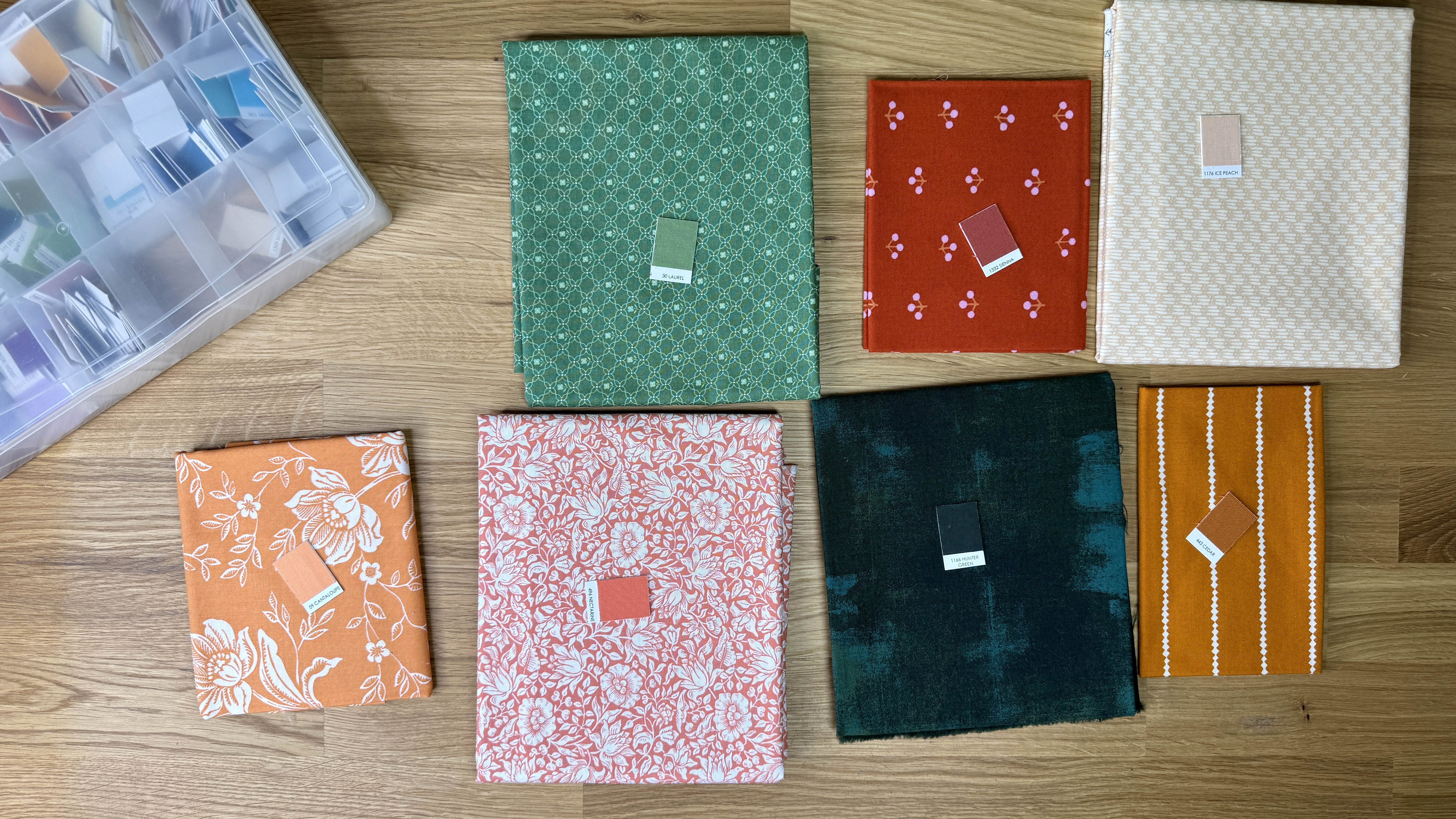
Here's my final palette, built out from that one QuiltCon print:
- Feature: deep green print with coral tulips, sage leaves, and rust berries
- Light: a soft peach geometric
- Coral: a coral and white floral
- Rust: a rust print with tiny pink cherries
- Sage: a sage green geometric
- Deep green: a mottled deep green blender
Notice how the palette splits between warm and cool. The peach, coral, and rust are warm. The greens are cool. That balance came straight from the feature print. If warm and cool colors are new to you, How Color Temperature Changes the Feel of Your Quilt explains why that mix works.
Every fabric in the stack traces back to a color in the feature. That's the whole method.
Build Your Own Palette
Want a head start? Grab my free quilt color palettes. Pick one that catches your eye, take it to your stash, and use Steps 3 through 5 to build it out with fabrics you already own.