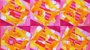
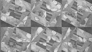
When I was still a little new to quilting, I found the perfect fat quarter bundle to make a baby quilt for a friend. Cute, right? Then I took a course about color and learned more about value. When I took all the color out, it really fell flat. With the exception of the dark pink fabric, everything is the same value. It all looks like a blob. The colors weren't the problem. Value was.
First, What Value Means
Value is how light or dark a fabric is, set apart from its color.
That is the whole definition. A pale yellow and a pale blue can have the same value, even though one is warm and one is cool and they look nothing alike. Line up a butter yellow, a soft pink, and a baby blue, and they can read as the same lightness.
Color is the hue. Value is the light or dark of it. Two different things, and we tend to only notice the first one.
Why Value Is the Part That Matters
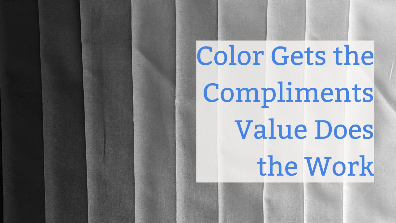
Here is the sentence I wish someone had told me years ago. Color gets the compliments, but value does the work.
Value contrast, the difference between your lights and your darks, is what lets your eye see the design at all. It is what makes a star look like a star instead of a smudge. Put beautiful fabrics together with no value contrast, and the design disappears into mud. Every time.
That was my yellow gold, tangerine, and teal block. Three colors I adore, all sitting at nearly the same value. Pretty, and completely flat.
The Mistake Almost Everyone Makes
We pull fabrics we love, and they are usually mediums. Not too light, not too dark, all in that comfortable middle. They go together beautifully.
That is exactly the trap. When everything is the same value, it all blends. The fabrics get along so well that your design has nowhere to show up.
How to Actually See Value
Our eyes are easily fooled by color, so we need a few tricks to see past it.
The easiest one, and the one I use every single time, is to take a black and white photo on your phone. Strip the color away and the light and dark jump right out. If your block is a gray blob in that photo, you have your answer.
A few more that work:
- Hold up a red value filter, a tool that mutes color so you can judge value.
- Walk across the room and look back. Distance flattens color and shows you the contrast.
Any one of these will tell you the truth your color-loving eyes are hiding.
Light, Medium, Dark, and Why It Is All Relative
Once you can see value, sort your fabrics in a row from lightest to darkest. You are looking for a spread, not a cluster. Most blocks need a clear light and a clear dark to sing, with mediums to bridge them.
And here is the part that takes the pressure off. A fabric is not "a dark" all on its own. It is dark next to lighter fabrics, and light next to darker ones. Value is about the relationships in your specific pull, not a fixed label. My teal was the dark in one project and the light in another. Same fabric, different job.
If you want to learn more about choosing high- and low-contrast fabrics on purpose, I wrote a blog post on how to choose contrast based on the look you're going for.
The 60-Second Check Before You Cut
Do this every time, before a single cut. Lay out your fabric pull, take that black and white photo, and look. Can you still see the design? Do the pieces stand apart, or melt together?
If it is muddy, swap one fabric for something lighter or darker and shoot it again. Sixty seconds now saves you a finished block you are not proud of.
This is a trick I wish I had known much sooner.
You Can See It Now
Here is the good news. Once you learn to see value, you cannot unsee it. Your blocks stop falling flat, your designs start showing up, and choosing fabric stops feeling like a guess.
It is a skill, not a magic touch, and you build it one pull at a time.
If you want to go learn some more color terms, my Color 101 post is a good next stop, and learning color deeply is exactly what I'm building COLOR CO/OP for. It's a club for quilters who want to master color once and for all. There's a lot to worry about in this world. Let's take color off that list.