
Color is one of the biggest challenges quilters face. So many of us stay safe inside a designer’s fabric bundle because we don’t know how to step outside of it with confidence. The good news is that color can be learned. Once you know a few key terms and a couple of practical tricks, you’ll be choosing fabrics on purpose instead of by hope.
Today, we’re going to walk through the color vocabulary every quilter needs, the tools that make it easier, and a simple exercise to get you playing with color in your stash.
If You Only Remember One Thing, Remember This
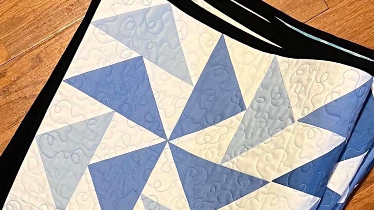
Value does the work in a quilt. Value is how light or dark a color is, and value contrast is what makes your quilt’s design visible from across the room. You can have the most beautiful color palette in the world, but if your fabrics are all the same value, your pattern will disappear into a blur.
Every other term in this post matters. Value matters most. Keep that in your back pocket as we go.
Color Terms Every Quilter Should Know
A few foundation terms first, because the rest of the post leans on them.
Primary colors. Red, yellow, and blue.
Secondary colors. Equal mixes of two primaries. Those are orange, green, and purple.
Tertiary colors. Equal mixes of a primary and the secondary next to it on the color wheel. Those are red-orange, red-violet, blue-violet, blue-green, yellow-orange, and yellow-green.
These are all hues. Which brings us to the next term.
Hue

Hue is what most of us mean when we say “color.” It’s a pure color with no white, gray, or black added. Blue is a hue. Yellow-green is a hue. Knowing hue helps you decide if you want a blue quilt or a green one. It’s the starting point.
Value

Value is how light or dark a color is. Light colors have high value. Dark colors have low value. A quilt needs a mix of values, so the colors don’t blend into one another and erase the design.
The single most useful trick in this post: snap a photo of your fabric pull with your phone, then switch it to monochrome. Color disappears, and you’re left looking only at value in your grayscale image. If everything looks like one gray smudge, you need more contrast. If you can clearly see where the lights, mediums, and darks land, you’re in good shape.
Tint

A tint is a hue with white added to it. Tints are paler than the original color. Pastels are tints. Reach for tints when you want a calm, soft, breezy feeling in a quilt.
Tone

A tone is a hue with gray added. Tones are duller and feel more sophisticated. They’re the colors that show up in a lot of modern quilts because they read as grown-up and grounded.
Shade

A shade is a hue with black added. Shades darken the color but keep the hue. They add weight and drama, and they’re great for backgrounds or for anchoring a bright quilt.
Warm vs. Cool Colors
Warm colors are the reds, oranges, and yellows. Cool colors are the greens, blues, and purples. Warm colors feel energetic and inviting. Cool colors feel calm and quiet. Mixing warm and cool colors in a single quilt creates contrast and movement. Sticking to one side of the wheel creates a more unified, mood-driven quilt.
If you want a quilt to feel cozy, lean warm. If you want it to feel serene, lean cool. Easy starting point.
Color Harmonies
A color harmony is a recipe for combining colors that play well together. Three are worth knowing for quilting.
Complementary. Two colors directly across the wheel from each other. Blue and orange. Red and green. Yellow and purple. Complementary palettes have the most contrast and feel the most energetic.
Analogous. Three colors sitting next to each other on the wheel. Blue, blue green, and green, for example. Analogous palettes feel calm and unified because the colors share so much family.
Triadic. Three colors evenly spaced around the wheel. Red, yellow, and blue, or orange, green, and purple. Triadic palettes feel balanced and lively.
When you’re stuck on what to pair, pick a harmony and go with it.
My Favorite Tools for Picking Color
Now that the vocabulary is in place, the tools make a lot more sense. These are the three I pull out every time I’m planning a quilt.

My color wheel. Great for checking hue and identifying color harmonies. A small investment that earns its keep on every project.

The Ultimate Color Tool. Created by quilters at C&T Publishing specifically for quilting color schemes. It has a card for each primary, secondary, and tertiary color with sections for tone, tint, and shade. Once you’ve picked your colors, you can take the tool to your stash to start pulling fabrics.

My Kona cotton color chips. This one is my favorite by a mile. One of the best things I ever did was cut up my Kona cotton color card and store the chips by color in a small storage box. When I know I’m making a blue and orange quilt, I can pull from those slots and move the chips around until I’m happy with the combination. Then I either quilt in those exact solids or take the chips to my stash to match print fabrics.
Putting it All Together
Here’s how the vocabulary shows up in a quilt pull.
Start with a hue. Say you want a blue quilt. Pull a few blues from your stash.
Add value. You want a mix of light, medium, and dark blues, not all mediums. Use the monochrome photo trick to check.
Add range with tints and shades. A pale blue tint, a deep blue shade, and a medium blue in between give you layers without leaving the color family.
Pick a color harmony. If you want contrast, add an accent in the complementary color (orange). If you want calm, add an analogous color (such as blue-green or violet).
Choose your background. A blender in a tint, tone, or shade that doesn’t compete with your feature fabrics works beautifully. (More on this in my post on blender fabrics for quilting, which is the natural follow-up to this one.)
You don’t need to run through every step every time. But walking a fabric pull through this checklist before you cut catches the surprises that turn into “why doesn’t this quilt look right” later.
Your Color Challenge
Ready to play? Here’s an exercise to do this week.
- Pick one hue from your stash. Any color you want.
- Pull a tint, a tone, and a shade of that hue. Three fabrics total.
- Lay them out and snap a photo.
- Switch the photo to monochrome. Check your value range.
- If your values are spread out, you’re in great shape. If they’re all bunched in the middle, swap one fabric for a lighter or darker version and try again.
Share what you pull. I’m @loveofthread on Instagram, and I love seeing what quilters come up with.
This post includes affiliate links. You pay nothing extra, and I earn a small commission to add to the fabric budget. Thanks!