Download 10 done-for-you color palettes right now, and you're automatically on the list to know the moment The COLOR CO/OP enrollment opens. One form, both things.
Color Theory for Quilters: Value, Contrast, Palettes, and More
Color is a Skill, Not a Gift
Here's something I believed about myself for a long time: I'm just not good with color. I watched other quilters pull together gorgeous fabric combinations and assumed they had some gift I'd missed out on. Like color sense was something you were born with, and the line was already gone by the time I showed up.
It took me years to figure out that wasn't true. The quilters I admired hadn't been born with perfect color instincts. They'd learned the vocabulary. And once I learned it too, everything changed.
Color feels hard in quilting because nobody teaches the vocabulary. Most of us learn from a pattern, and the pattern says "choose a light fabric, a medium fabric, and a dark fabric." Full stop. No explanation of what light and dark actually mean on a bolt of fabric, or why it matters, or what happens when you get it wrong. You make your best guess, cut in, and hope for the best.
That guesswork is exhausting. And it's completely unnecessary.
This page is what I wish someone had handed me earlier. By the time you reach the bottom, color decisions won't feel like luck anymore. You'll have a vocabulary, a process, and a way to audition any fabric combination before a single piece gets cut.
Here's what we're covering: the three building blocks of color, why value is the one element that makes or breaks most quilts, how to use color temperature and contrast on purpose, and how to build a palette for any project. There's also a free download waiting for you. Ten 10 done-for-you color palettes you can use on your next quilt, no color decisions required. And at the very end, something I've been building that I think you're going to love.
The Three Building Blocks of Color
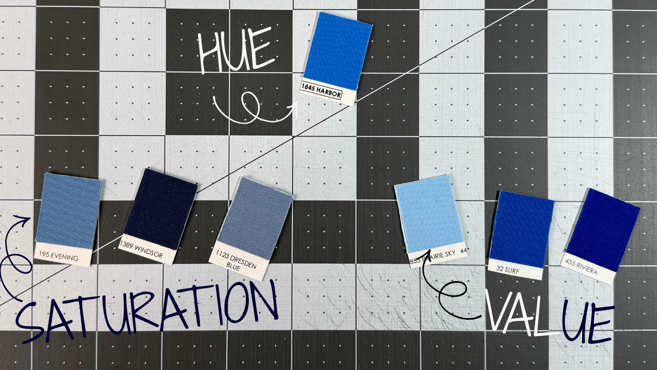
Every color you've ever pulled from a bin, held up to a window, or fallen for at a quilt show can be described using three things: hue, saturation, and value. That's the whole vocabulary. Once you know what those three words mean, you'll have a framework you can use on any fabric, in any shop, for any project.
Hue
Hue is what most of us mean when we say "color." Red. Blue. Green. Orange. It's the pure, named version of a color, the one you'd point to on a color wheel. When someone says, "I want a blue quilt," they're talking about hue.
Saturation
Saturation is how intense or muted a color is. A fire-engine red and a dusty rose are both red. Same hue, completely different saturation. High saturation means vivid and punchy. Low saturation means toned down, almost grayed out. Most quilting fabric falls somewhere in the middle, and that range is a big part of what makes a fabric collection feel cohesive when you pull it off the bolt.
Value
Value is how light or dark a color is. This one is the game changer. Pale yellow and navy blue are completely different hues with completely different saturations. But value is what tells your eye where one shape ends, and another begins. It's the contrast engine behind every quilt pattern you've ever loved and the reason some quilts pop off the wall while others just sort of sit there.
Most quilters think they're picking fabrics by color, but quilt pattern structure runs almost entirely on value. A log cabin block, a flying geese block, a lone star. All of them depend on lights and darks landing in the right places. The hue is almost secondary.
That's why we're spending the whole next section on value. It's the building block most quilters underestimate, and understanding it will change how you shop for fabric.
Color Value: The One That Makes or Breaks a Quilt
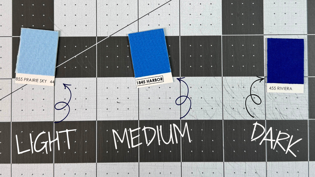
Here's the thing about value that took me the longest to really understand. It doesn't matter how beautiful your fabrics are individually. If the values are wrong for the pattern, the design will disappear. Not muddy or slightly off. Gone. A sawtooth star made entirely from medium-value fabrics looks like a solid blob with seam lines running through it. The star is still there mathematically, but your eye can't see it.
Value is relative, which is what makes it tricky. A fabric isn't light. It's lighter than the thing next to it. That lavender you've been calling a light might read as a medium the moment you set it next to a true white. Context changes everything. This is why so many quilters end up with a stack of fabrics that look great in the store and look muddy together on the design wall.
The fastest way to check your values is the squint test. Lay your fabrics out in the arrangement they'll be in the finished quilt, then squint your eyes until things start to blur. What you're looking for is contrast. If you can still see distinct shapes and the pattern is holding together, your values are working. If everything merges into a flat field, your values are too close, and you need to push your lights lighter or your darks darker.
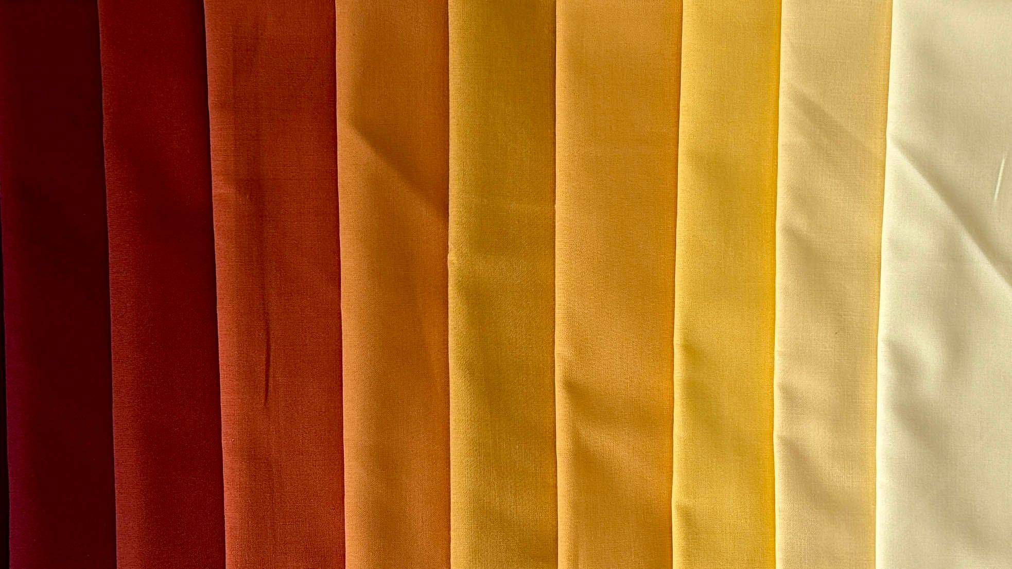
What light, medium, and dark mean on a bolt is simpler than it sounds. Light means it reads as pale, airy, and receding. Think white-on-white, soft blush, pale yellow. Dark means it reads as saturated, heavy, and advancing. Think navy, black, deep plum, forest green. Medium is everything in between, and most of your fabric stash probably lives here. Medium fabrics are the hardest to work with because they don't give the pattern the contrast it needs to read.
When value is right, quilts have movement. Blocks appear to float or spin. Depth shows up without the design feeling busy. When value is off, the most intricate piecing in the world won't save it. That's not a discouraging truth. It's great news, because value is a skill you can learn and a problem you can fix before you cut a single thing.
I wrote a whole post on color value that goes deeper on this, including what to do when you can't tell if something reads light or dark and how to use your phone to check value in the fabric store. It's worth a read before you pull your next fabric pull.
Steal My 10 Go-To Palettes Based on Value
You just learned why value is the real reason a quilt reads right, or doesn't. These 10 palettes are already worked out for you, with the value choices explained so you can see the thinking behind each one, not just copy the colors.
Color Temperature: Warm, Cool, and How to Use Both
After value, temperature is the color concept that gives quilters the most trouble. Not because it's complicated, but because most of us have never thought about it on purpose. We just grab what we love and hope it works together. Sometimes it does. Sometimes the quilt comes off the design wall looking oddly unsettled, and we can't figure out why.
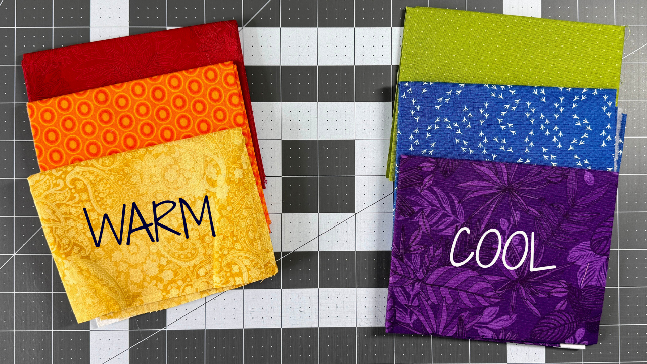
Warm colors are your reds, oranges, and yellows. Cool colors are your blues, greens, and purples. That much is intuitive. What's less intuitive is what temperature does in a quilt: warm colors advance and cool colors recede. Visually, warm colors come toward you. Cool colors pull back. This is the same principle painters use to create depth in a landscape, and it works the same way in a quilt block.
When you mix temperature intentionally, you get depth and movement without adding complexity to the pattern. A log cabin with warm fabrics in the center and cool fabrics toward the outer edge will feel like the center is glowing. A star block with a warm background and cool points will feel like the star is sinking into the fabric instead of popping off it. Neither version is wrong. They're just different moods, and now you get to choose which one you want.
The quilts that fight themselves are the ones where temperature is running in all directions with no intention behind it. A mix of warm and cool isn't the problem. Quilts with both temperature ranges can be stunning. The difference is whether the warm and cool fabrics are placed to create something or just dropped in wherever they fit. If you look at a quilt and it feels busy but not interesting, temperature that's working at cross-purposes is often the culprit.
A simple place to start: the next time you pull fabrics for a project, sort them into two piles: warm and cool. See which pile is bigger. If everything landed in one pile, consider reaching for one or two fabrics from the other side.
Color Contrast: High, Low, and Everything In Between
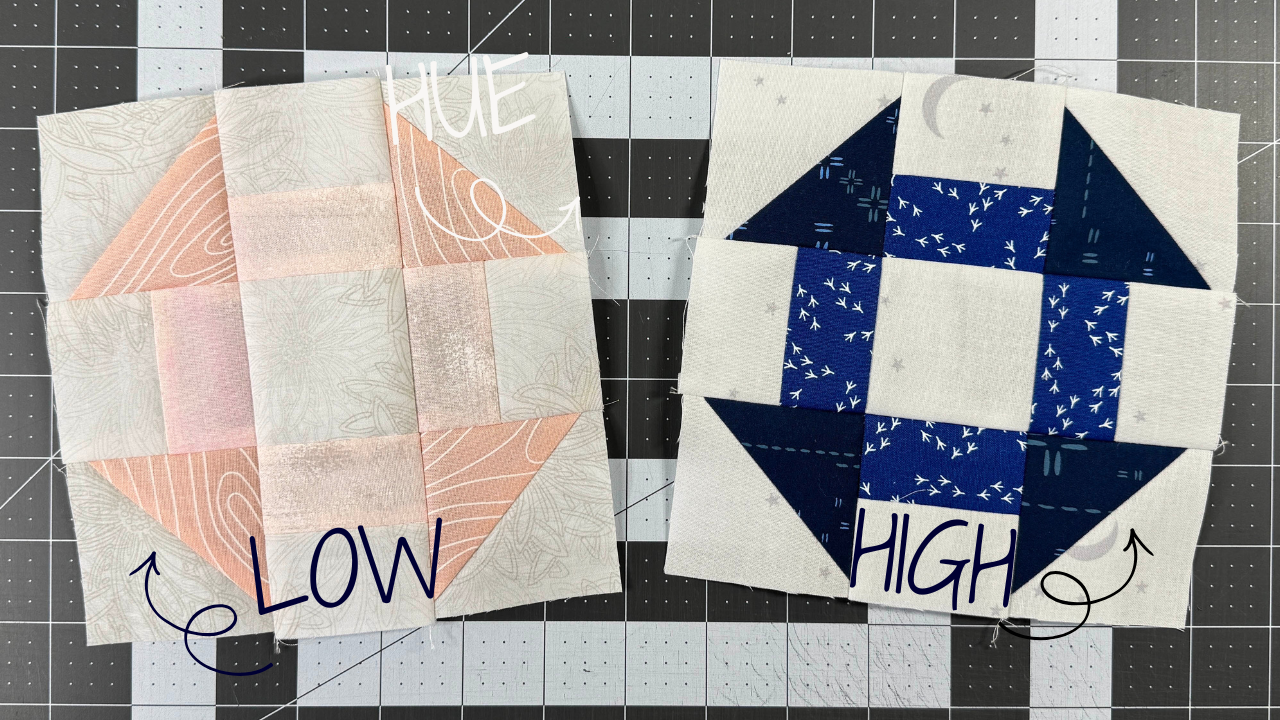
Contrast and value are related, but they're not the same thing. Value is about an individual fabric: how light or dark it is on its own. Contrast is about the relationship between fabrics: how much difference there is when they sit next to each other. You can have a whole quilt made of dark fabrics with strong contrast between them. You can also have a quilt with a wide value range where everything blends because the fabrics are too similar in tone. It's the gap between them that matters.
When a pattern says, "choose a light background and a dark focal print," the designer is telling you what contrast level the block needs to read the way it does in the sample. High contrast gives you graphic, bold, and geometric. Think black and white quilts, or anything that reads clearly from across the room. Low contrast gives you soft, blended, and painterly. The kind of quilt that looks almost watercolored, where the blocks flow into each other instead of standing apart.
Here's what most quilters don't realize until they see it: the same pattern at different contrast levels is essentially a different quilt. A churn dash in black and white and a churn dash in two soft dusty greens have the same seams in the same places. But one is modern and graphic and one is quiet and vintage. Neither is better. But only one is the quilt you were picturing, and contrast is the thing that gets you there.
Choosing your contrast level intentionally is one of the fastest ways to get better results from the patterns you already own. Before you pull fabric, ask yourself: do I want this quilt to read boldly from a distance, or do I want it to reveal itself up close? That question will tell you whether you need high contrast, low contrast, or something in between. And if you're not sure which you prefer, try pulling two small audition pieces, one from each end, and hold them together. Your eye will tell you immediately which direction feels right.
How to Build a Quilt Color Palette
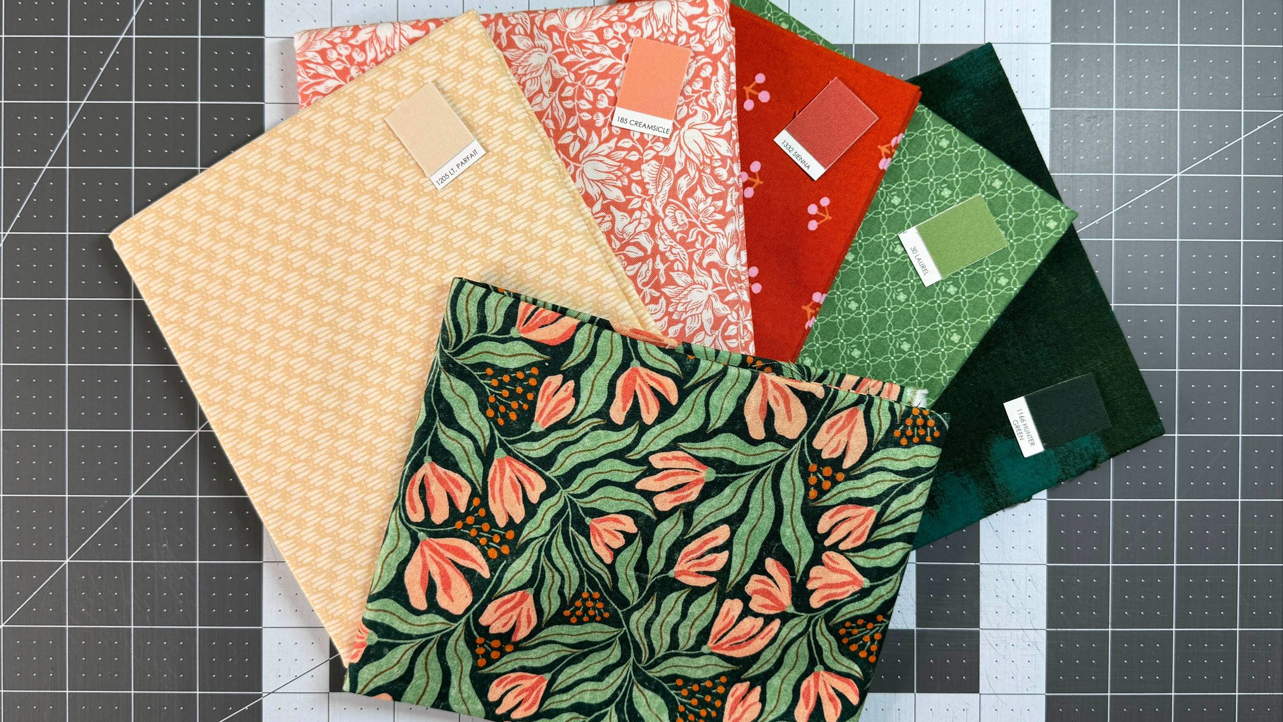
You've covered the vocabulary: hue, saturation, value, temperature, and contrast. Building a palette is just making a series of small decisions with those concepts as your guide. There are three ways in, and which one you use depends on where you're starting from.
The first is starting from a print you love. This is the pull-out method, and it's the most intuitive starting point for most quilters. Find a fabric with multiple colors in it that makes you happy every time you look at it. Then pull coordinates and supporting fabrics that echo each color already in that print. The print is doing the color work for you. It's already a cohesive palette. Your job is just to pull from it. When in doubt, let the print be your anchor and make sure everything else in the pile appears somewhere in it.
The second is starting from a color family. You know you want something blue, or warm and autumnal, or soft and feminine. Pick one color as your anchor, then build around it by varying value, saturation, and temperature within that family. A quilt made entirely of blues works beautifully when you've got light sky blues, deep navies, muted slate, and a pop of teal. Same family, enough variation to keep it from going flat.
The third is starting from the pattern's fabric requirements. The pattern tells you what it needs: a light background, a dark focal print, a medium accent. Use those categories as your filter as you pull. This is the most structured approach, and it's the best one to start with when color decisions feel overwhelming. You're not making it up. You're solving a puzzle the designer already laid out for you.
As for how many fabrics: enough to create interest, not so many that nothing has room to breathe. For scrappy quilts, 8 to 15 fabrics is usually a sweet spot. For a clean, modern look, 3 to 6 fabrics with intentional contrast often reads better than 20 competing prints. The goal is variety within cohesion.
If putting any of this into practice still feels like a lot, I have something that will help. I put together 10 done-for-you color palettes you can use on your next quilt, all the decisions already made and ready to pull from. Grab the free download below.
Or Skip Straight to 10 Done-For-You Palettes
Building a palette from scratch takes practice, and that's fine. If you'd rather start cutting fabric sooner, grab these 10 ready-to-use palettes, value choices already made for you.
How to Choose Fabric When You Can't See It In Person
Online fabric shopping has changed everything about how quilters build their stashes, and not always for the better. The selection is incredible. The convenience is real. But screens lie. A color that looks like a warm coral on your monitor might arrive as a cool salmon. What reads as a rich navy online can show up at your door as a flat, almost black. This isn't the shop's fault, and it isn't yours. It's just the nature of fabric photography and screen calibration.
Value is your best anchor when you're shopping online. Even if the exact color doesn't photograph true, a light reads as a light and a dark reads as a dark reliably. If you're buying to fill a specific value role in your quilt, focus there first. Color you can manage. Getting the value wrong is what causes problems after the fabric arrives.
Beyond color and value, you want to understand the weight and hand of a fabric before you buy in quantity. This is where reviews matter more than product descriptions. Read what other quilters say about how it moves, how it presses, whether it frays more than expected. A beautiful print on a stiff, difficult-to-press fabric is going to frustrate you every time you sit down to sew.
When you're taking a risk on a new shop, a new manufacturer, or a color that's tricky to read online, ordering a sample or swatch first is almost always worth it. A few dollars spent on a test cut can save you from a disappointing cut of two yards. Many shops offer swatches and it's worth using the option, especially for anything you're planning to buy a lot of.
And if you do take a risk and the fabric arrives looking a little different than expected, give it a chance on the design wall before you give up on it. If it still doesn't work, send it to your stash so it can be perfect for a future project. Fabrics that look wrong alone often work beautifully in a group. The linked post goes deeper on all of this, including a few tricks for reading online listings more accurately before you buy.
Common Color Mistakes Quilters Make
I have made every single one of these mistakes. Some of them more than once. So this is not a list of things you shouldn't do. It's a list of things most quilters do at some point, with a quick fix for each one so you can catch them before you're too far in.
Similar Values
You pull a beautiful group of fabrics, they all feel cohesive, and then you sew the first few blocks and wonder why the pattern isn't showing up. Squint at your fabrics before you cut. If everything blurs together, you need more contrast in your value range. Add something lighter or darker than what you already have. This is almost always the fix.
Forgetting About Scale
Fabric prints come in small, medium, and large. When every fabric in a quilt is a tiny print, the whole surface blurs into visual noise from any distance. When every fabric is a large, bold design, the prints compete with the pattern itself. Mixing scale, at least one small, one medium, and one larger print, gives the eye somewhere to rest and creates the kind of variety that reads as intentional.
Not Auditioning Fabrics Before Cutting
It's easy to buy pieces separately, trust that they'll work, and then lay everything out at home to discover they don't. Before you cut into anything, spend 20 minutes on your design wall or floor with the fabrics arranged roughly the way they'll appear in the quilt. If something isn't sitting right, it's much easier to swap it out at this stage.
Fabrics That Fight Each Other
This happens when you pull based on each fabric being beautiful rather than asking whether they belong together. A quick diagnostic: look at the pile and ask what connects them. If the answer is "I love all of them" and nothing else, something probably needs to come out. Try removing one fabric at a time and see if the group settles.
How to Read a Pattern's Fabric Requirements
Every quilt pattern uses a shorthand vocabulary to describe what kind of fabric goes where. Background fabric. Feature fabric. Accent. Supporting print. If you've ever stared at those words and wondered exactly what they mean in practice, you're not alone, and understanding them will make you much more confident substituting fabrics you actually have for what the pattern lists.
"Background fabric" doesn't always mean white or cream. It means the fabric that recedes, the one the pattern is being read against. In a pattern designed for a dark background, navy or charcoal might be the background. The background is whatever creates the contrast that lets the design show up. When a pattern specifies a background fabric, ask yourself: what is this block reading against? That's your background, whatever color it happens to be.
"Feature fabric" is the star of the block, usually a larger print, a bold print, or the print you're building the rest of the quilt around. It often has more colors in it than the other fabrics and sets the palette. "Supporting fabrics" are everything that complements the feature without competing with it. The hierarchy matters because it tells you which fabric to choose first. Start with the feature, then pull supporting fabrics that echo it. Not the other way around.
Some patterns are designed for specific color placement, and the block structure depends on it. A tumbling blocks pattern needs three distinct value positions, light, medium, and dark, in exactly the right places for the 3D illusion to work. If you play with those positions, the illusion disappears. Other patterns are genuinely forgiving, and nearly any combination of fabrics will read well. Knowing which kind you're working with tells you how much creative latitude you actually have.
When you want to substitute a color, match the value role rather than the color itself. If a pattern calls for a dark teal and you want to use dark burgundy instead, ask: does my burgundy fill the same value role as the teal? If it's equally dark and reads as a dark against the fabrics around it, your substitution will almost certainly work. The color is flexible. The value role usually isn't.
The COLOR CO/OP: Learn One Element at a Time, Together
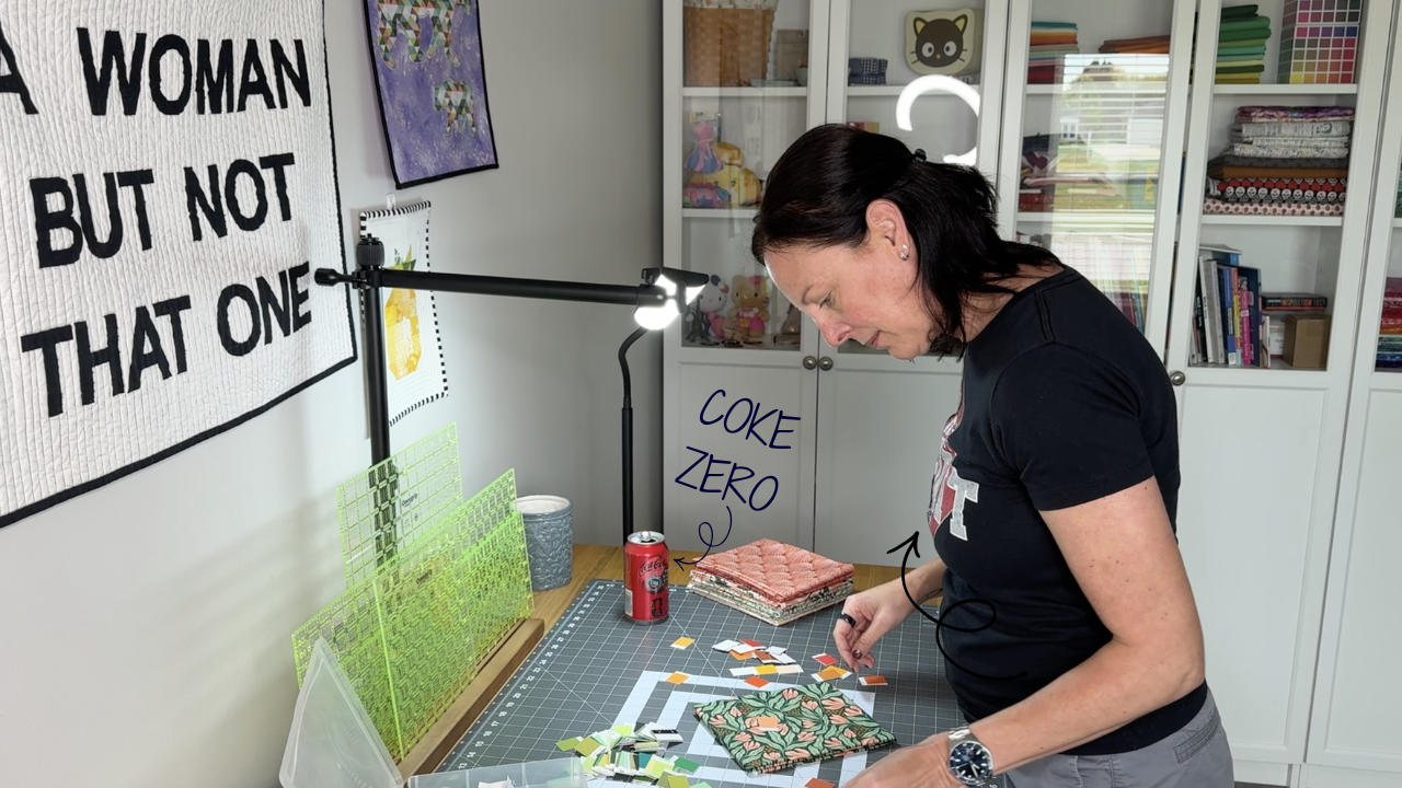
Everything on this page is vocabulary. The COLOR CO/OP is where you practice using it.
It's my monthly membership for quilters who want to feel at home with color instead of second-guessing every fabric pull. Each month we explore one element of color together. I bring a live lesson with demo and a full Q&A session, so there's time for every question you've been holding onto. The replay goes up the next day. You also get a downloadable lesson highlights PDF to put in your sewing space for quick reference, because color concepts are so much easier to apply when you can glance at them while you're actually cutting fabric.
Each month also includes an original quilt block pattern designed to put that month's lesson directly into fabric. This is the part I'm most excited about. Learning about color value is one thing. Cutting into fabric and watching it work is something else entirely. Members also get a discount code to my pattern and class shop every month, because you shouldn't have to pay full price to keep learning. Throughout the year there are rotating bonus sessions too: fabric pull critiques, color palette challenges, themed challenges to get you playing with color on purpose, and "How Do I Quilt It" Q&A sessions for when you're getting close to enough blocks for a full quilt top and wondering what to stitch across all of them.
You build toward a finished quilt at your own pace. There is no such thing as behind.
We're starting in the best place possible: color value, using blue as our teaching palette. If you read Section 3 of this page and felt that click of recognition, the first month is going to feel like the natural next step.
The COLOR CO/OP launches on Black Friday. The first 100 founding members get a special introductory price that locks in for life. You'll always pay the founding rate, no matter what the membership costs in the future. If you want in on that, the list below is where to be.
If you already grabbed the color palettes above, you're already on the waitlist. If you haven't yet, grab them here and you'll be first to know when The COLOR CO/OP opens.