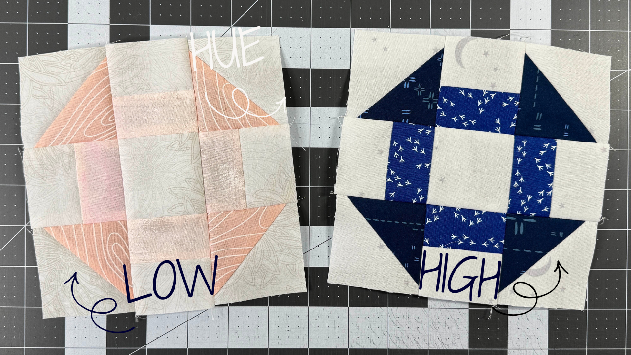
Put two fabrics side by side. One of two things happens. They stand apart, or they melt into each other.
That's contrast. And it decides how your whole quilt reads, from across the room and up close.
Neither one is better. They just do different jobs. So let's dive in.
What Contrast Is
Contrast is how one fabric compares to the fabric next to it.
When the difference is obvious, that's high contrast. Your eye sees two separate pieces right away. When the difference is small, that's low contrast. The pieces blend, and your eye slides from one to the next.
Contrast is always about the relationship. A fabric isn't high contrast on its own. It's high contrast next to something. Move it to a different spot in the quilt, and it can blend right in.
High Contrast: When You Want the Shapes to Pop
High contrast puts the design front and center. Every point, every seam, every shape reads clearly.
Sawtooth Splendor is my go-to example. The stars are teal and navy, and they sit on a white background. There's no question where a star ends and the background begins. You can spot them from the other end of the house.
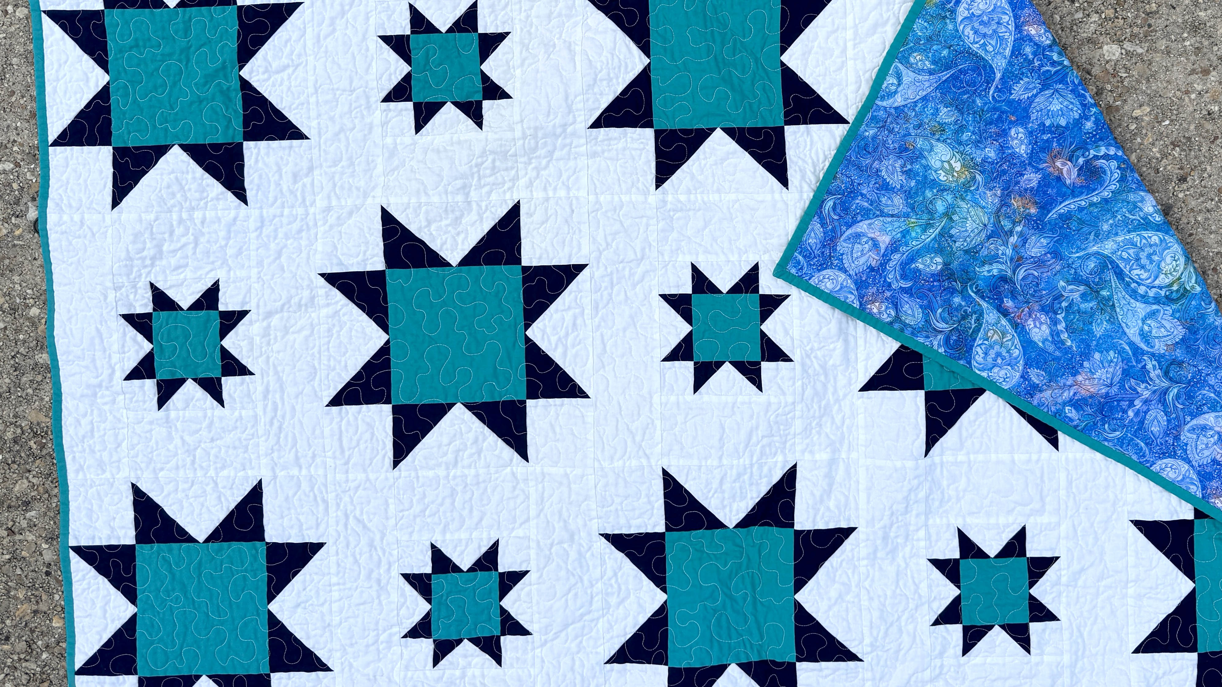
High contrast works well when:
- You want a crisp, graphic, modern look
- The block design is the whole point of the quilt
- You want the quilt to read clearly from a distance, like on a bed or a wall
One thing to know going in. High contrast shows everything, including a point that didn't quite match. That's not a reason to avoid it. If you can't see a mistake from 5 feet away or passing by at 5 mph, it doesn't exist.
Low Contrast: When You Want the Quilt to Feel Soft
Low contrast is quieter. The fabrics blend, the edges soften, and the quilt feels calm and cozy.
The shapes are still there. You just find them when you get close instead of from across the room.
Low contrast works well when:
- You want a soft, calm, or cozy feel
- You want the overall color to carry the quilt more than the individual blocks
- You want your quilting to get some attention, since the texture from your stitches has more room to show
The tradeoff is that the block design gets quieter. If you picked a pattern because you love the blocks, low contrast can hide the very thing you fell for.
One Quilt, Both Kinds of Contrast
You don't have to pick one for the whole quilt.
Holland is a great example. The flying geese run in an ombre from light to dark against a light background. At the lighter end of the ombre, the geese sit close to the background, so the contrast is low. They fade in softly. At the darker end, the geese stand far apart from the background, so the contrast is high. They pop.
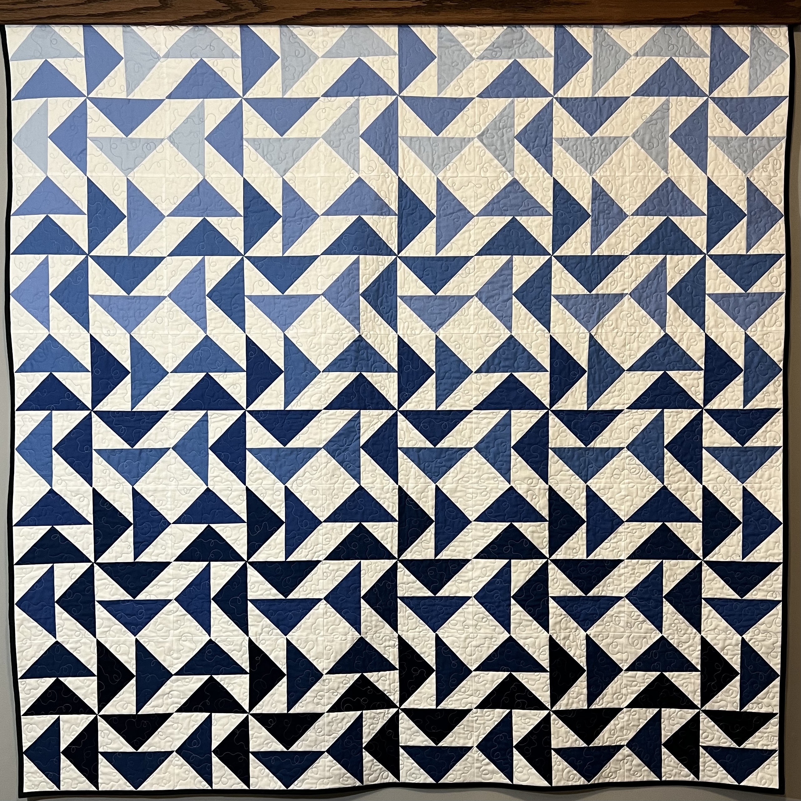
Same pattern. Same background. The contrast shifts depending on where you are in the ombre, and that shift is what gives the quilt its movement.
So when you choose fabrics, ask yourself two questions. What do I want to stand out? And what do I want to fade back?
Beware the Bundle
Fabric collection bundles are gorgeous. Every print was designed to go with every other print. That's exactly why they can trip you up.
A collection is built around a color story, not a contrast plan. Plenty of bundles land mostly in the middle, with very little that's truly light or truly dark. Everything coordinates, so everything blends.
That's great if you want a low-contrast quilt. It's a problem if your pattern needs the shapes to pop.
So don't assume the bundle did the work for you. Pull fabrics from it based on your contrast goal:
- For high contrast, find the lightest and darkest prints in the bundle and check the gap between them. If it isn't big enough, add a light or a dark from your stash.
- For low contrast, keep the prints that sit close together and set aside the one or two that jump out.
- For both, like an ombre, line the bundle up from light to dark and look for gaps where you need a fabric to bridge the steps.
The prints that didn't make the cut aren't wasted. They're a head start on your next quilt.
Two Quick Ways to Check Contrast Before You Cut
Your eyes love color, and color can fool them. These two checks take less than a minute.
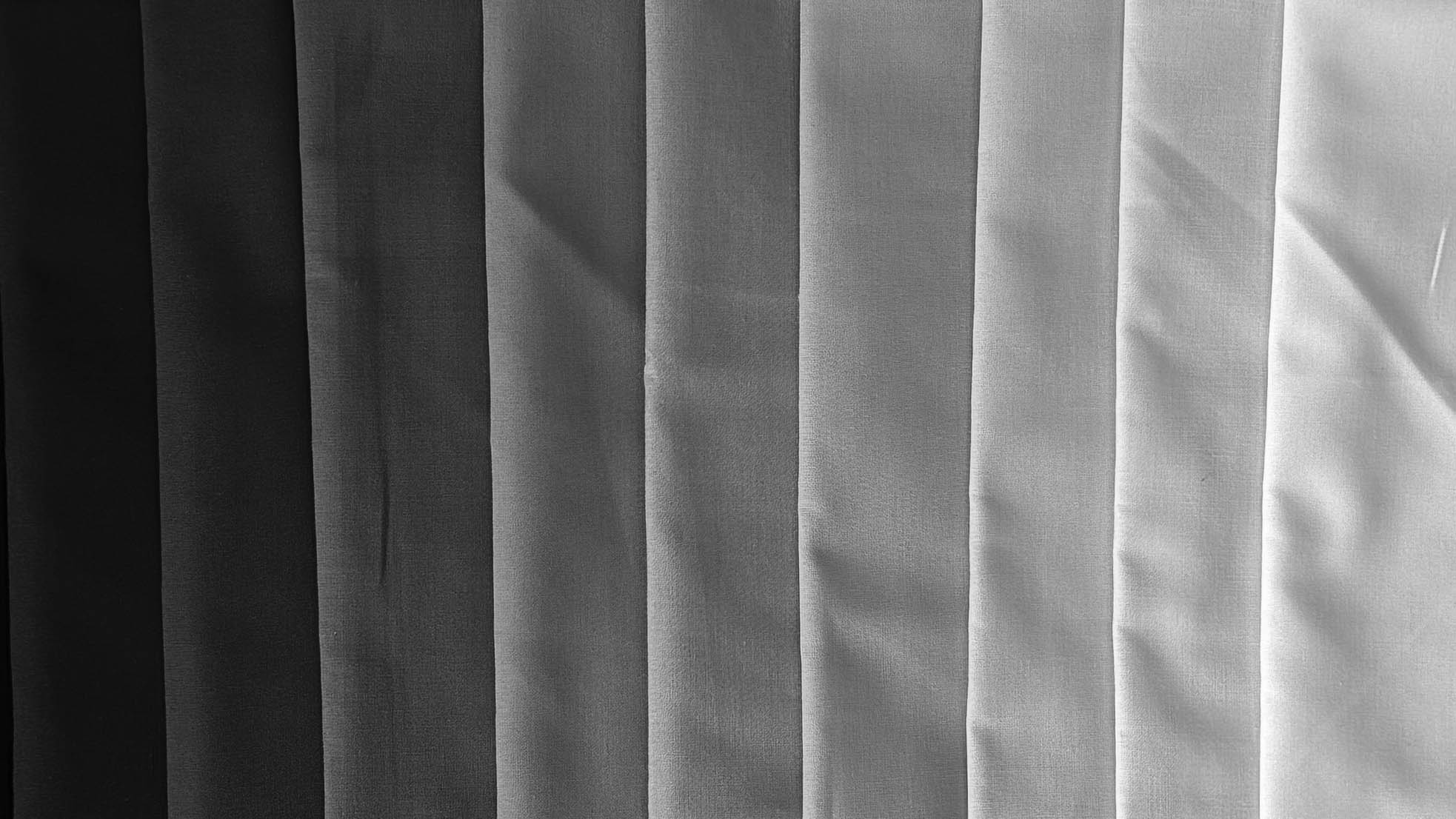
Take a black-and-white photo. Lay your fabrics side by side and snap a photo with your phone's black-and-white filter. With the color gone, you'll see right away which fabrics stand apart and which ones melt together.
Step across the room. Lay the fabrics next to each other on your cutting table or put them up on a design wall. Then walk across the room and look back. Distance shows you what the quilt will look like on a bed or draped over the couch. If two fabrics you meant to contrast turn into one blob, swap one of them.
Not what you wanted? Trade a fabric and check again. It's a lot easier to swap a fat quarter than to unpick a finished block.
Start with a Palette That Already Works
If choosing fabric is the part that stalls you, you don't have to start from scratch. I put together a free pack of 10 quilt color palettes, each one built to hold up in a quilt, plus the simple trick that shows you why they work.